Most if not all adsense publishers are looking for ways to increase their ctr (click through rate) to increase their adsense earnings. Ctr is the percentage of clicks per 1000 impressions. In other words increasing ctr means to increase the number of clicks at the same level of traffic (visits or pageviews per day or month).
So is it possible to increase the number of clicks without increasing the visitor count? Depending on how poor your current layout or ad placement is, there are ways to optimise ad placement and get the ctr to improve. Once very simple optimisation (one that is suggested by google all the time) is to use larger ad units.
CTR Growth
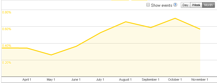
Well before moving into more theory, I would like to show you what kind of improvement I am talking about. Take a look at the ctr graph of binarytides.com (yes we use adsense here as you can on the upper part of the page).
As you can see the ctr rose from about 0.37% to around 0.66% from June to August. That is nearly double(2x) or 100% increase. Coming straight to the point, this increase was achieved through changing of ad unit sizes, layout and position. However the significant change was the ad unit size.
Lets take a look at what kind of change I did.
My earlier ad unit layout
1. Horizontal ad unit (728 x 90) below post heading.
2. Vertical ad unit (160 x 600) on the right side navigation bar.
3. Horizontal ad unit (728 x 90) at the post end.
By visualising the sizes you can understand that I had neatly placed them in combination with the post content, so that they looked professional and did not make the site look very spammy.
For a long time, I sticked to this layout, because it was the only kind of layout that looked very un-commercial, professonal, un-spammy and so on. I believed that this is necessary to make the blog look a high quality one.
However the ctr was .37% on an average as shown in the graph. And this was not generating the kind of revenue I was expecting from adsense. So then after reading lot lot on adsense optimisation on other blogs and google help pages, I decided to go with larger ad units.
My current ad unit layout
1. Large square (336 x 280) at beginning of post.
2. Medium square (300 x 250) on sidebar top.
3. Large square (336 x 280) at end of post.
So this new layout is 3 squares. The change in the ctr was what you can see in the graph. Within a month, it doubled. This is the visible result, but yes there is a lot of theory behind it.
Putting an ad unit inside the main content of the page (which is the post body here), makes a big difference. If the ads are neatly placed on the borders/sides/above/below the main content, readers are able to neatly ignore them. However putting them right as a part of the content, make the ad presentation much more aggressive.
So if you too are looking for ways to increase click-through-rate on your blog/website then you can try these ideas (if you have not done so already) and see what difference does it make.
